
Creating Trace Analytics Dashboards
Guide to creating Trace Analytics Dashboards from aggregated queries in Traces Explorer
Creating custom trace analytics dashboards in Last9 allows you to visualize and monitor trace data through aggregated metrics. This guide explains how to create and promote trace queries into dashboard visualizations.
Starting with Traces Explorer
Using Query Builder Mode
-
Navigate to the Traces Explorer in Last9
-
Use the Span or Trace tabs to build your query
-
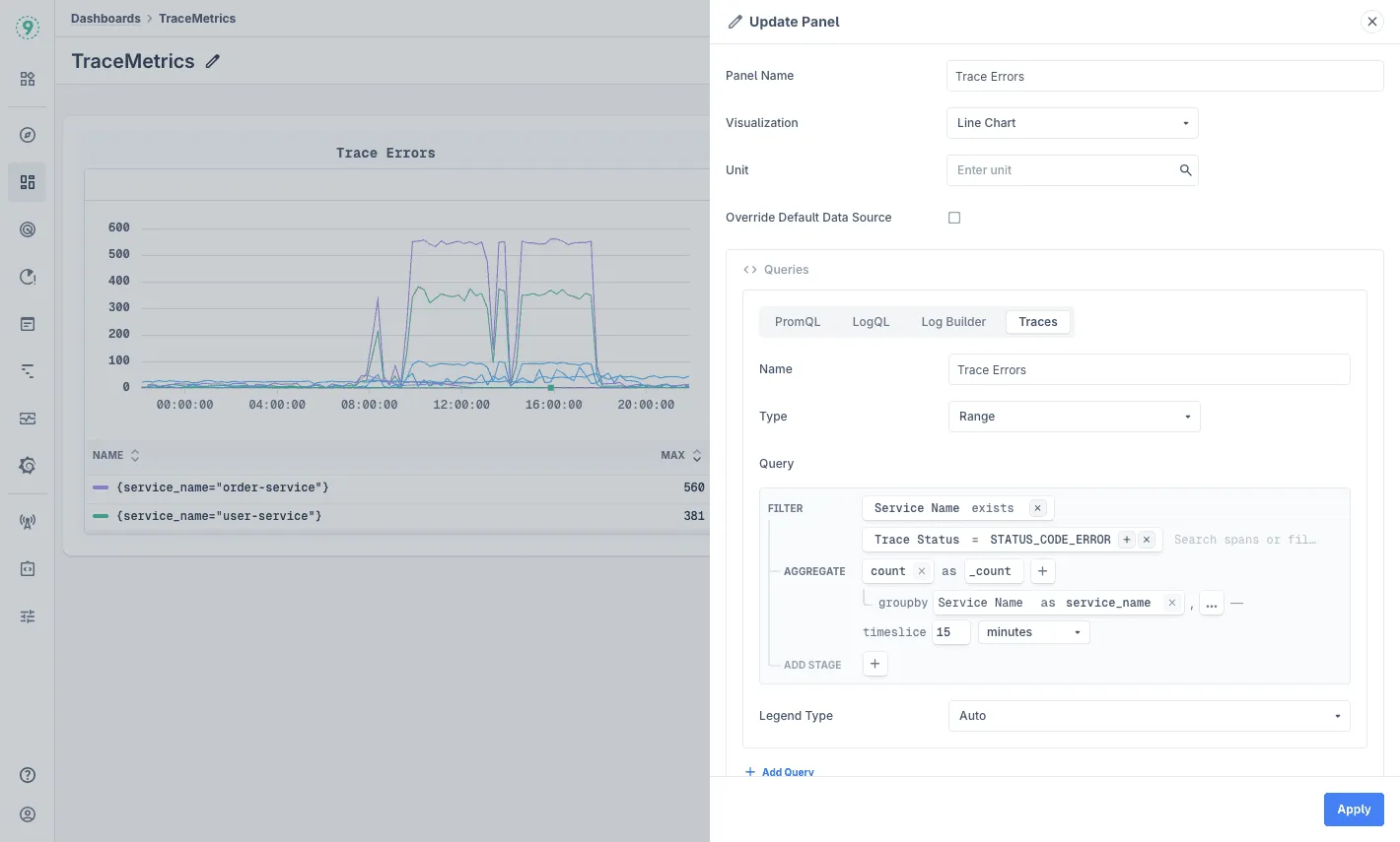
Add a FILTER stage to narrow down your data
Service Name existsTrace Status = STATUS_CODE_ERROR -
Add an AGGREGATE stage with a timeslice to create a time-series visualization
count as _countgroupby Service Name as service_nametimeslice 15 minutes -
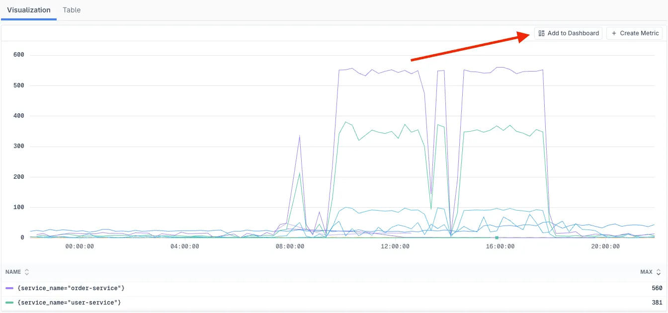
Click Run Query to preview your visualization
-
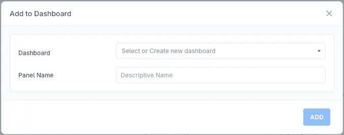
Promote the query to a dashboard by clicking the Add to Dashboard button
-
Create a new dashboard or add it to an existing dashboard by providing a descriptive panel name
-
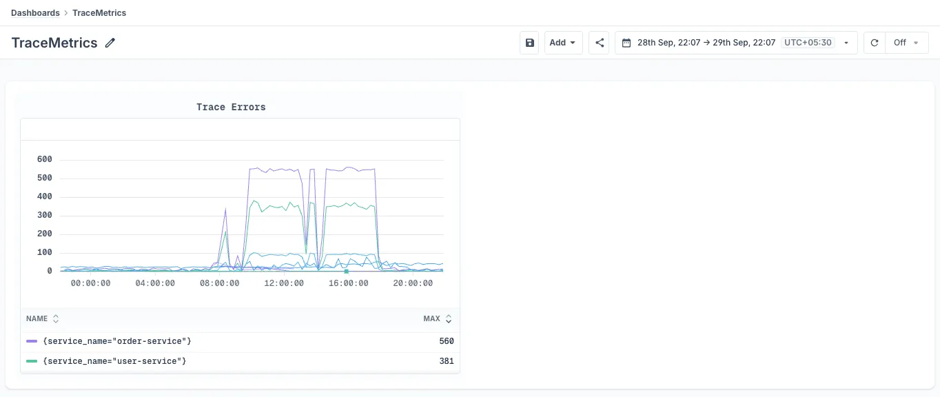
You will be redirected to the dashboard with your query added as a panel
-
Edit the panel by clicking the ⋮ button and selecting edit
-
Add multiple panels to the dashboard by following the same steps
Query Construction Guidelines
Aggregation Requirements
To create dashboard visualizations from traces:
- timeslice parameter is required for time-series charts
- Use groupby to split metrics across different dimensions
- Choose appropriate aggregation functions based on your analysis needs
Common Aggregation Patterns
Error rate tracking by service:
count as error_countgroupby Service Name as servicetimeslice 5 minutesP99 latency monitoring:
quantile(0.99, duration) as p99_latencygroupby Service Name as servicetimeslice 10 minutesRequest volume by endpoint:
count as request_countgroupby http.route as endpointtimeslice 15 minutesSupported Aggregation Functions
Last9 supports several aggregation functions for creating meaningful visualizations:
-
Count-based aggregations:
- count: Counts the number of spans or traces
- count field: Counts non-null values of a specific field
-
Statistical aggregations:
- sum: Sums the values of a numeric field
- avg: Averages the values of a numeric field
- min: Finds the minimum value of a numeric field
- max: Finds the maximum value of a numeric field
- median: Finds the median value of a numeric field
- stddev: Calculates the sample standard deviation
- stddev_pop: Calculates the population standard deviation
- variance: Calculates the sample variance
- variance_pop: Calculates the population variance
-
Quantile functions:
- quantile: Calculates approximate quantile (value between 0 and 1)
- quantile_exact: Calculates exact quantile (value between 0 and 1)
Best Practices
Time Range Selection
- Match timeslice interval to your dashboard’s time range
- For real-time monitoring, use shorter intervals (1-5 minutes)
- For historical analysis, use longer intervals (15-60 minutes)
- Consider query performance when selecting time ranges
Query Performance
- Filter on Service Name for significantly faster query execution
- Use exists operator for field presence checks
- Test queries with smaller time ranges before expanding
- Leverage indexed fields for better performance
Dashboard Organization
- Group related trace metrics together
- Use clear, descriptive panel titles
- Include service context in dashboard descriptions
- Set appropriate refresh intervals based on monitoring needs
- Consider creating separate dashboards for different services or teams
Visualization Tips
- Use groupby to compare metrics across services
- Combine error counts with latency metrics for comprehensive monitoring
- Create separate panels for different percentiles (p50, p95, p99)
- Monitor both successful and failed requests for complete visibility
Troubleshooting
Please get in touch with us on Discord or Email if you have any questions.