In an earlier post, I talked about how SLOs can be misleading, and the Service Level Indicator in consideration was Uptime. Latency is another SLI that is almost impossible to be accurate about.
Like Uptime is measured as % and aggregated over a month/year/week, based on time window choice, Latency is for a unit of time (ms and s.), and the preferred aggregate is percentile.
The purpose of this post is to debunk common mistakes I made while dealing with Percentiles.
Why is it important to understand percentiles in depth? Because one of the critical Indicators of software performance, Latency, is measured using Percentiles. Somebody cannot deal with something as clinical as performance without understanding the behavior of its yardstick.
But I use the <foo>_tool that calculates the percentiles. Should I care?
All of these tools, and solutions do the same things. They assume a user to have a statistical understanding of these constructs. They are not wrong, nor have they been lying. That is just how math works ¯\(ツ)/¯.
What is a Percentile?
In everyday conversations, Percentage, Percentile, and Percentile Rank are invariably confusing terms. Partially because the only time you encountered them before SRE became a fad was during Management or Engineering entrance examination results.
Given a series of records, a percentile is a value greater than that many percentages of the records.
Example: 20th Percentile is a value greater than 20% of the values.
Alternatively, In a room of 20 people, if you are the fourth tallest person, then your height is the 80th percentile, i.e., 80% people == 16 people are shorter than you.
Some common confusions with Percentiles
are
We use this one reasonably liberally, but in reality, there cannot be a 100th percentile.
The percentile value is supposed to be greater than 100% of the values, including the value. Hence there cannot be a P100.
Say there are 100 distinct records. The last value is better than 99 records hence, P99 but not P100. In a sample set of 10000 distinct values, the highest value is more significant than 9999 others. Hence P99.99 but not P100.
If you are the tallest person in a room of 20 people, you are NOT taller than 100% of the people.
P100 is often confused with MAX. Using MAX is fine. Labeling it as P100 is a misnomer.
What is P0?
The 0th percentile is way more confusing than the 100th percentile.
Suppose you had a scale from 0 to 100. Including both 0 and 100, there would be 101 values!
Imagine there are 100 distinct records; they can either be 0 to 99 or 1 to 100. The simplest formula for percentile is that the nth record in N records denotes the Pth percentile
As P100 is often used interchangeably with MAX, P0 is used with MIN.
What are P95 and P99 latency?
Say there are 100 distinct records; the 95th percentile is the one that covers 95% of the records—so 95th value.
However, in 10 distinct records, the 95th percentile cannot be a discrete value. So what would the result be?
Why is this important?
When was the last time your application gave your exactly multiple of 100 records when you wanted to calculate P90!
There are two ways to calculate the value of percentile when your record set is not a multiple of 100:
- Discrete (Nearest Rank)
In the absence of a discrete data point, use the nearest value using a rounding technique. Example: In a record set of 10 records, since you would never find 95, you can round off to the 9th or 10th value, but neither is the authentic P95. - Interpolated
In the absence of an actual data point, one may use an appropriate Curve-Fitting technique to fill in the missing values. (Another good read) - One can achieve Curve fitting with one of these techniques:
1. By finding an exact fit for every data point (a process called interpolation)
2. By drawing trends out of the data
3. By employing data smoothing to come up with a function that represents the smoothed graph
Discrete vs. Interpolated Percentiles
What’s the missing value? 1,2,3,4,5,6,?,8
Chances are, you will say 7. Which may or may not be incorrect, but it is the most reasonable fill.
For a demonstration of these samples, I will often use standard SQL as an example, but the principles are similar to a data processing tool/framework of your choice. Be it Pandas or Excel too!
You would be surprised how often you consume Interpolated percentiles, more than the discrete percentiles.
To demonstrate, I will show an example of how percentiles are computed in Postgres. Assume a table that has the following data.
SELECT * from test;
| a | b |
| 1 | a |
| 2 | a |
| 3 | a |
| 4 | a |
| 5 | a |
Nearest Rank (Discrete)
==SELECT percentile_disc(0.8) WITHIN GROUP (ORDER BY a)FROM test;==
|-----------------|
| 4               |
Curve Fitting (Continuous)
SELECT percentile_cont(0.8)WITHIN GROUP (ORDER BY a) FROM test;
|-----------------|
| 4.2             |
You would expect both the percentiles to be the same, but continuous interpolation, while it may seem incorrect to the naked eye, is far more useful in almost all cases.
For the discrete to be accurate, your record set has to have a perfect multiple of the desired percentile number of records, which will rarely be the case.
Either way, the percentile is a rounded-off value OR an interpolated value. Both of them will be approximated and never accurate.
that for a system that receives ten requests/second, ten events happen per second, which will emit data worthy of processing
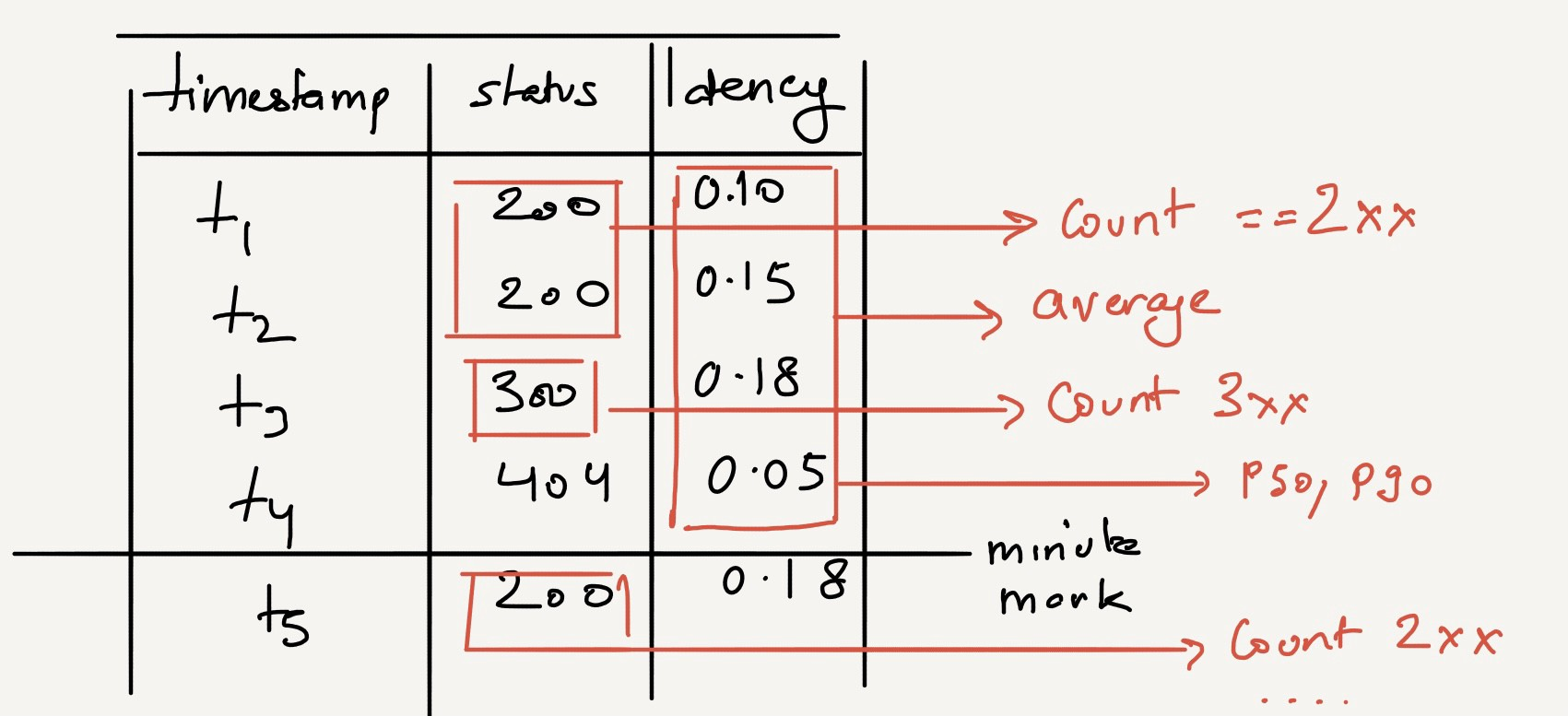
In the context of SLIs (Service Level Indicators), data needs to be computed from multiple requests that arrive in various bursts. For cognitive ease, let’s say that for a system that receives ten requests/second, ten events happen per second, which will emit data worthy of processing.
For every request that comes in, you need to
- Provide throughput, using request COUNT
- Provide latency, using AVERAGE response time,
- Provide Latency degradation using the 90th percentile and maybe others!
Here’s a pictorial representation. Every point, Tx, brings in some features, namely status and request_time. How do these get converted into metrics and dashboards?

CSV is just for the illustration of the data. It does not imply that we should save data as CSV.
Data, per request
server,timestamp,status,latency
a,1599962400,200,0.5
a,1599962401,200,0.45
a,1599962401,304,0.2
a,1599962401,500,0.8
It needs to be folded into something like this
server,timestamp,throughput,2xx,3xx,4xx,5xx,avg_latency
a,1599962400,2,3,6,0,0,0.5
a,1599962460,7,6,10,1,2,0.48
(per-minute aggregation)
Either the LoadBalancer, the web-server, or the reverse-proxy performs these aggregations for you and emits an interval value or they spit out raw log lines and allow you to extract this Information.
Either way, an aggregation is needed.
To club the requests arriving together, a brief introduction to Aggregation will help.
A quick rundown of aggregations
Given the record set, One can apply different aggregation functions to the attributes.
- Throughput For a given time range, a SUM / COUNT of the number of requests is enough.
- Average Latency For the same time range, Summation of the response times/throughput
So far, so good. For a given time range, we can apply these simple functions to pull the desired metric value.
Now, how about,What was the average latency from 7:30 - 7:45 PM 3 weeks back?
There is ten events/sec, around 106060/hr, around 250K/day, about 1.5m/week, and about around 6 million/month. Per source!
Assuming there are ten services, each query will aggregate and filter 6 million * 10 = 60 million rows.
We know we indeed cannot retain every event to recompute each time. Hence, We need to look elsewhere for an answer.
Two concepts required to be understood before we hunt further
- Streaming Aggregation
- Downsampling
In another blog, we have also explained the SLI vs SLO nuances in detail.
Streaming Aggregation
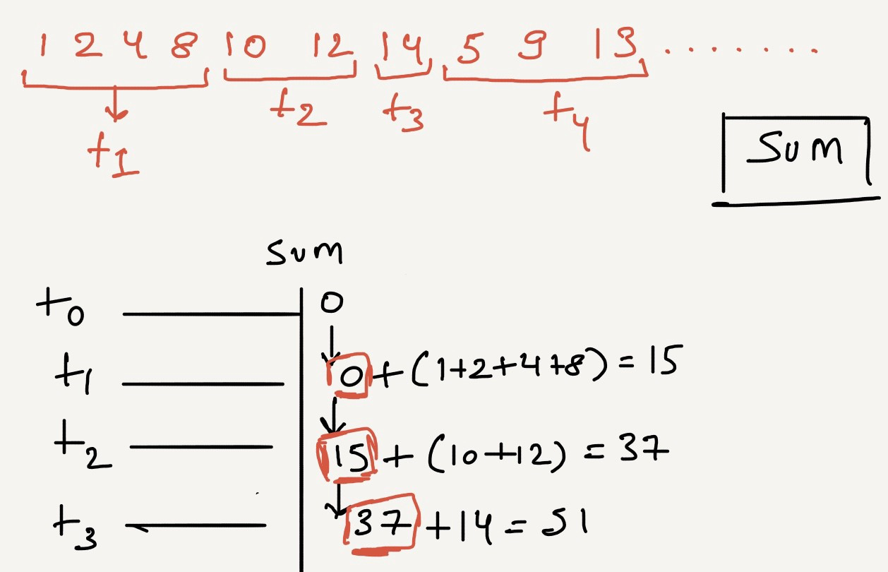
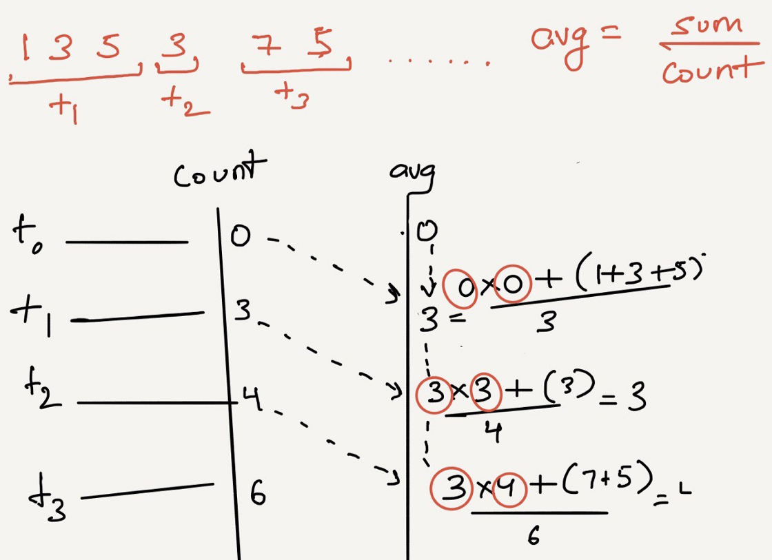
It’s impossible to query the ENTIRE data range to produce an aggregate. Simpler techniques will be to Incrementally aggregate the Incoming data by using functions that save some state from the previous run and resume without caring for the entire record set.
Calculate the throughput (SUM)

Or, Moving Average for a stream of input

Down-sampling
All granular analysis requires only recent data. At the same time, older information is used to compute trends.
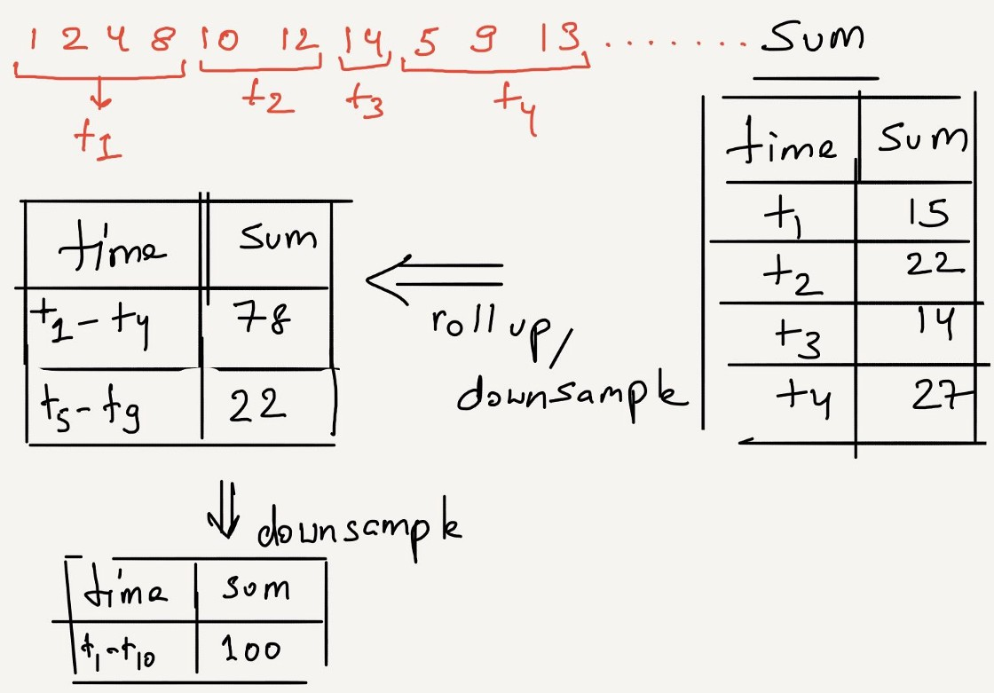
Downsampling is the process of reducing the resolution of data. In our example data, there are 6 million records per month. If we decide to keep data per minute instead of per second, it will reduce the number of records by 60x. 6 million rows to 100K rows.

As information gets stale, queries usually shift towards trends compared with Needle-in-haystack search. So it’s wise to start folding the data. This process is called downsampling.
As obvious as it may seem, downsampled data lose all visibility into the distribution of data within the sample.
Example: If downsampling is performed for a record-set of 5 seconds (1, 2, 1, null, 1) using the SUM every 5 seconds, Sum will be 5.
Also, no longer you can tell that 4th second didn’t produce any data. It’s a trade-off between accuracy vs. performance. If you pay attention, at any severe scale, it is just inevitable to get accustomed to approximations.
Downsampling needs two components
- Interval(s) Clubbing data across the Time range using the function. ****
- Aggregation Function Very much like Streaming aggregation, a mathematical function that can merge records.
Example: To downsample status_2xx and status_5xx, you could use the mathematical function SUM
Input
|timestamp   | status_2xx  | status_5xx |
|------------|-------------|------------|
|         0  |           5 |          1 |
|         10 |           5 |          2 |
|         20 |             |          1 |
|         30 |           1 |          2 |
|         40 |          10 |          4 |
|         50 |          20 |          2 |
|         60 |           5 |          4 |
Downsampled every minute
|timemestamp | status_2xx | status_5xx |
|------------|------------|------------|
|          0 |         41 |         12 |
|         60 |          5 |          4 |
Downsampling can be applied across multiple intervals using the same aggregate function. Example: Ancient data can be downsampled to a day, using the same mathematical function that was is used to downsample second → minute → hour
Downsampling works well when using mathematical aggregation functions like SUM, MIN, MAX, COUNT, AVG, and MEAN.
But what about Percentile?
Can down-sampling be applied to Percentiles?
Say we only save P50, P75, and P90 of records
Saved
timestamp   | requests | p50  |  p75  |  p90  |
|-----------|----------|------|-------|-------|
|         0 |      100 | 50ms | 100ms | 500ms |
|        60 |      200 | 30ms | 50ms  | 200ms |
What would the resultant P50 (or P75) when you club these two records together?
You cannot tell. You would need the ENTIRE record set to re-compute the percentiles.
Why do you need the entire record setTwitter?
P50 wants the latency for 50% of both the samples. i.e. 100+200/2 = 150 requests.
- 50 requests from first sample are ≤ 50ms
- 100 requests from the second sample are < 30ms.
Now these two may add up to make the lowest 150 requests of the ENTIRE sample set, in which caseP50 will be 50ms
However, another distribution where
- 10 requests from first sample are ≤ 20 ms
- 100 requests from second sample are ≤ 30ms
- Another 40 samples from the second sample are < 45ms.
In this case, the lowest 150 requests of the entire sample set came mostly from the 2nd sample and weighed ≤ 45ms. In this case theP50 will be 45ms
You see what happened here. Without knowing the entire distribution, p50 across multiple sets will be an uneducated guess.
Any attempt to deduce this, like weighted-average, mean, or median, will be smart but inaccurate. So we need the ENTIRE data set, but we concluded earlier that it's infeasible to use the ENTIRE data set to re-compute on each request.
So what’s the solution?
You approximate. Because, your Percentiles are incorrect P99 of the times!
Now that we have a sufficient foundation of percentiles as the go-to metric for latency, the question has to be asked — Is there a better way to approach latency calculations? There is, and we will soon be adding our findings on blog.last9.io. Subscribe to our newsletter and keep that popcorn on standby.
Last9 is a Site Reliability Engineering (SRE) Platform that removes the guesswork from improving the reliability of your distributed systems.
Still having second thoughts about subscribing to our newsletter? Maybe this post on how number-crunching horses relate to SRE tooling will change your mind. Also, did we mention that we are hiring to build the next-gen SRE observability platform? If you are interested, reach out to us on Twitter or email us at hello@last9.io


