

If you’ve ever tried to set up OpenTelemetry visualization, you know it can be a bit overwhelming. But don’t worry—in this guide, we’ll break it all down step by step. Whether you’re just getting started or looking to fine-tune your existing setup, this walkthrough will help you get the most out of your telemetry data.
Why Visualizing OpenTelemetry Data Matters
Telemetry data is only as useful as the insights you can extract from it. Logs, traces, and metrics provide raw information, but without visualization, it can be difficult to spot patterns or diagnose performance issues. Proper visualization helps in identifying trends, troubleshooting bottlenecks, and optimizing system performance.
For example, let’s say a microservices-based application experiences periodic slowdowns. Without visualization, you might sift through thousands of logs to identify a pattern.
With a well-designed dashboard, you can immediately see spikes in request latency, pinpoint the exact service causing issues, and take action faster.
For a deeper dive into building effective OpenTelemetry dashboards, check out this guide on OpenTelemetry UI.
How OpenTelemetry Visualization Works
OpenTelemetry visualization helps teams make sense of the massive amounts of telemetry data—metrics, logs, and traces—generated by their applications.
Instead of sifting through raw data, visualization tools turn it into interactive dashboards, graphs, and charts that highlight performance trends, errors, and system bottlenecks.
Here’s how it works, step by step, with real-world examples:
Instrumentation – Capturing the Right Data
Imagine you’re running an e-commerce website. You want to track how long it takes for product pages to load.
With OpenTelemetry, you instrument your backend services to collect metrics on response times, trace customer sessions, and log errors when something breaks.
Data Collection – Gathering Insights from Multiple Sources
Once your services are instrumented, OpenTelemetry agents or collectors pull data from various sources—application code, databases, and even cloud infrastructure.
For example, if a user searches for a product and gets an error, OpenTelemetry captures logs from the backend service handling search queries.
Processing and Exporting – Sending Data to Visualization Tools
The collected data isn’t useful until it’s structured and sent somewhere for analysis.
OpenTelemetry processes the data (removing noise, enriching it with metadata like user location), then exports it to an observability tool like Last9, Grafana, or Datadog. This is like taking raw ingredients and prepping them before cooking.
Storage and Querying – Making Data Easily Searchable
Now that the data is in a visualization tool, it gets stored in different formats—metrics in time-series databases, traces in distributed tracing tools, and logs in log management systems.
This allows engineers to search for patterns, like:
- How many users experienced slow checkout times in the past hour?
- Which API requests are failing the most?
Visualization and Analysis – Bringing Data to Life
This is where the magic happens. Your visualization tool presents data through real-time dashboards, line charts, and trace waterfalls. For example:
- A heatmap might show that server latency spikes during peak shopping hours.
- A trace visualization could reveal that a slow third-party payment API is causing checkout delays.
- A real-time alert might warn that error rates have doubled in the past 10 minutes.
To learn how to visualize OpenTelemetry data using Grafana, check out this guide on OpenTelemetry with Grafana.
5 Best OpenTelemetry Visualization Tools in 2025
There are plenty of tools out there, but not all of them integrate well with OpenTelemetry.
Best Visualization Tools for OpenTelemetry
1. Last9
Last9, trusted by industry leaders like Probo, Games24x7, CleverTap, and Replit, is a Telemetry Data Platform that optimizes cloud-native monitoring by balancing performance, cost, and user experience.
Easily integrating with OpenTelemetry, Prometheus, and more, Last9 unifies metrics, logs, and traces, making it highly efficient for managing high-cardinality data at scale.
Best Features:
- Built-in OpenTelemetry compatibility for seamless observability.
- Smart alerting and real-time metrics through the Control Plane.
- Efficient high-throughput data management for cost-effective monitoring.
Ideal For:
- Monitoring Kubernetes workloads (e.g., tracking pod health, resource usage, and service dependencies).
- Enterprises handling millions of telemetry events per second while ensuring operational intelligence and deep observability insights.
2. Grafana
Grafana is a widely adopted open-source visualization tool known for its flexible and customizable dashboards. It supports multiple data sources, including Prometheus and Loki, making it a go-to solution for OpenTelemetry visualization.
Best Features:
- Rich dashboarding with custom visualization options
- Hassle-free integration with Prometheus and Loki
- Supports real-time monitoring and alerting
Ideal For:
- Tracking error rates, latency, and service performance across microservices
- Building custom monitoring solutions for DevOps and SRE teams
For insights on optimizing performance and scalability, check out this guide on scaling the OpenTelemetry Collector.
3. Jaeger
Jaeger is a distributed tracing tool designed to help developers understand request flows across microservices. It’s essential for troubleshooting latency and dependency issues in complex systems.
Best Features:
- End-to-end request tracing
- Root cause analysis for slow transactions
- Scalable architecture for cloud-native environments
Ideal For:
- Debugging slow API requests in e-commerce or SaaS platforms
- Identifying bottlenecks in multi-service architectures
4. Kibana
Kibana, part of the Elastic Stack, is an excellent tool for log analysis and visualization. If your telemetry data is stored in Elasticsearch, Kibana is the natural choice for exploring and making sense of the logs.
Best Features:
- Powerful log visualization and search capabilities
- Machine learning-powered anomaly detection
- Custom dashboards for security and operational insights
Ideal For:
- Investigating system failures and error spikes
- Detecting unusual traffic patterns in web applications
5. Prometheus
Prometheus is a leading time-series monitoring tool that works well with OpenTelemetry for metric storage and visualization. While it’s primarily a monitoring solution, its powerful query language (PromQL) makes it a strong contender for visualization as well.
Best Features:
- Efficient time-series data storage and querying
- Built-in alerting with PromQL-based rules
- Scalable pull-based architecture for metric collection
Ideal For:
- Observing CPU, memory, and network usage in cloud environments
- Setting up alerts for performance degradation in microservices
Each of these tools offers unique advantages depending on your specific OpenTelemetry needs. Whether you’re dealing with logs, traces, or metrics, choosing the right visualization tool can significantly enhance your observability strategy.
Learn how to instrument your Python applications with OpenTelemetry in this detailed guide on OpenTelemetry Python Instrumentation.
How to Set Up OpenTelemetry Visualization
Now that you’ve chosen a visualization tool let’s walk through the setup process step by step to ensure effortless data collection, processing, and visualization.
Step 1: Instrument Your Application with OpenTelemetry
Instrumentation is the process of integrating OpenTelemetry SDKs into your application to collect traces, metrics, and logs. The SDK you use depends on your programming language.
Example: Setting Up OpenTelemetry in a Node.js Application
- Install the OpenTelemetry SDK for Node.js:
npm install @opentelemetry/api @opentelemetry/sdk-trace-node- Initialize the Tracer in Your Application:
const { NodeTracerProvider } = require('@opentelemetry/sdk-trace-node');const provider = new NodeTracerProvider();provider.register();This setup ensures that OpenTelemetry starts capturing trace data as your application runs.
Step 2: Configure and Deploy the OpenTelemetry Collector
The OpenTelemetry Collector acts as a centralized processing unit for telemetry data before sending it to your chosen visualization tool.
Run the OpenTelemetry Collector
Execute the following command to start the collector:
./otelcol-contrib_linux_amd64 --config otel-collector-config.yamlConfigure the Collector with a Pipeline
Modify the otel-collector-config.yaml file to define your receivers and exporters. Example configuration:
receivers:  otlp:    protocols:      grpc:      http:
exporters:  prometheus:    endpoint: "0.0.0.0:9464"
Download and Set Up the Collector
wget https://github.com/open-telemetry/opentelemetry-collector-releases/releases/latest/download/otelcol-contrib_linux_amd64chmod +x otelcol-contrib_linux_amd64Step 3: Integrate OpenTelemetry with Your Visualization Tool
Each visualization tool has its method for ingesting OpenTelemetry data. Here’s an example of integrating with Grafana using Prometheus:
Add Prometheus as a Data Source in Grafana
- Go to Grafana → Configuration → Data Sources
- Select Prometheus
- Enter the URL:
http://localhost:9464 - Click Save & Test
Import an OpenTelemetry Dashboard in Grafana
- Use Grafana’s built-in OpenTelemetry dashboard
- Or create a custom dashboard by selecting relevant metrics and defining visualization panels
Step 4: Start Monitoring and Visualizing Telemetry Data
Once your setup is complete, your dashboard will begin displaying real-time telemetry data.
- Use Interactive Filters – Drill down into specific time frames, error categories, or services.
- Analyze Performance Trends – Identify anomalies, bottlenecks, and areas for optimization.
- Set Alerts – Configure alerts to notify you of critical issues before they impact users.
Find answers to the most common OpenTelemetry queries in this comprehensive guide.
How to Customize Your Dashboard for Better Insights
A well-designed OpenTelemetry dashboard isn’t just about visual appeal—it should provide actionable insights to help you monitor, diagnose, and optimize system performance.
Here’s how to make your dashboard truly effective.
1. Focus on Key Metrics That Matter
To gain meaningful insights, track the most critical telemetry data:
- Latency: Measure how long requests take at different percentiles (P99, P95, P50) to identify the slowest responses.
- Error Rate: Monitor the percentage of failed requests to quickly detect issues affecting users.
- Throughput: Track requests per second to ensure the system can handle current and projected loads.
- Resource Usage: Keep an eye on CPU, memory, and network consumption to prevent resource exhaustion.
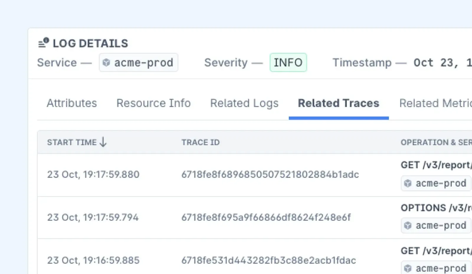
2. Correlate Logs, Metrics, and Traces for Deeper Analysis
A well-structured dashboard should allow easy navigation between different types of telemetry data:
- Jump from a Slow Trace to Related Logs – If a request is slow, instantly check related logs to understand why.
- Compare Error Spikes with Resource Usage – Identify if increased error rates correlate with high CPU or memory consumption.
- Analyze Historical Trends – Compare current performance with past data to spot regressions or improvements.
3. Set Up Alerts and Anomaly Detection for Proactive Monitoring
An effective dashboard should notify you when something goes wrong, allowing you to respond before users are impacted.
- Use Grafana Alerts or Prometheus Alertmanager to automatically trigger notifications when:
- Latency spikes beyond acceptable limits.
- Error rates exceed predefined thresholds.
- Unusual traffic patterns indicate potential DDoS attacks or system misbehavior.
Best Practices for OpenTelemetry Visualization
- Use Dashboards Effectively: Focus on critical metrics like request latency, error rates, and resource utilization. Avoid cluttering dashboards with too much information.
- Enable Alerts: Set up threshold-based alerts for anomalies. For instance, if the API response time exceeds 500ms, an alert should notify the team.
- Optimize Storage: Storing all telemetry data indefinitely can be expensive. Use aggregation techniques to retain only essential data over long periods.
- Keep Instrumentation Minimal: Avoid unnecessary instrumentation that adds overhead to your application. Only collect the data that provides actionable insights.
- Regularly Review Metrics: Telemetry needs to evolve. Periodically review and update your monitoring setup to reflect changing application behavior.
Learn how to use OpenTelemetry for Kubernetes autoscaling in this in-depth guide.
Conclusion
Setting up OpenTelemetry visualization doesn’t have to be complicated. With the right tool and proper configuration of the OpenTelemetry Collector, you can gain deep insights into your system’s performance.
Experimenting with different visualization techniques and refining dashboards helps make telemetry data more actionable and insightful.
And if you ever need further discussion, our Discord community is open. We have a dedicated channel where you can share your specific use case and connect with other developers.
FAQs
1. What is OpenTelemetry visualization, and why is it important?
OpenTelemetry visualization refers to the process of representing collected telemetry data (metrics, logs, and traces) in a visual format to help engineers monitor, analyze, and optimize system performance. Effective visualization helps in identifying bottlenecks, debugging issues, and ensuring application reliability.
2. Which tools support OpenTelemetry visualization?
Several tools support OpenTelemetry visualization, including:
- Commercial Solutions: Last9, Datadog, New Relic, Splunk Observability Cloud, Honeycomb.
- Open-Source Options: Grafana, Prometheus, Jaeger, Kibana (with Elasticsearch).
Each tool varies in features, scalability, and cost, so selection depends on specific observability needs.
3. Does OpenTelemetry support real-time visualization?
Yes, OpenTelemetry enables real-time visualization through integrations with tools like Last9, Grafana, and Datadog. These tools process incoming telemetry data and update dashboards in real-time, allowing teams to detect and respond to issues instantly.
4. Can OpenTelemetry be used with multiple programming languages?
Yes, OpenTelemetry is designed to be language-agnostic and supports multiple languages, including Java, Python, JavaScript, Go, .NET, and Rust. SDKs are available for each supported language to instrument applications effectively.
5. How does OpenTelemetry visualization impact application performance?
While OpenTelemetry provides valuable insights, improper implementation can impact performance due to high data volume and processing overhead. Best practices to mitigate this include:
- Using sampling techniques to limit trace collection.
- Aggregating and filtering metrics to reduce data noise.
- Optimizing storage and retention policies.
- Choosing efficient backends for data processing (e.g., Prometheus for metrics, Jaeger for tracing).
6. How can I correlate logs, metrics, and traces in OpenTelemetry visualizations?
Correlation is key to effective observability. Many visualization tools allow linking between logs, metrics, and traces:
- Use consistent labels and attributes across telemetry types.
- Tools like Last9, Datadog, and Splunk provide built-in correlation capabilities.
- Traces can be enriched with logs and metrics to provide contextual insights.
7. What challenges should I consider when visualizing OpenTelemetry data?
Common challenges include:
- High Cardinality: Large numbers of unique labels (e.g., user IDs) can impact performance.
- Data Overload: Too much telemetry data can lead to inefficient analysis—filtering and aggregation help.
- Tool Complexity: Some tools require fine-tuning and deep configuration for optimal use.
- Scalability Issues: Storage and query performance must be managed as data volume grows.
8. Can OpenTelemetry visualization help with anomaly detection?
Yes, many OpenTelemetry-compatible visualization tools (e.g., Last9, Datadog, and New Relic) offer AI-driven anomaly detection. These tools analyze historical trends and detect deviations to alert teams about potential incidents before they escalate.

