
January 2026 Release
Here’s a dirty secret about observability: most teams find out about outages from their customers. Not from their dashboards. Not from their alerts. From angry tweets and support tickets.
The excuse is always the same: “We have metrics! We have dashboards! We even have that AI thing now!”
And yet, somehow, your checkout endpoint has been returning 502s for forty-five minutes and you’re learning about it from the VP of Sales who just got off a call with your biggest customer.
This is the equivalent of putting a smoke detector in your kitchen and then covering it with a plastic bag because the beeping annoyed you during cooking.
We shipped four features this release that are, at their core, about the same thing: knowing before being told.
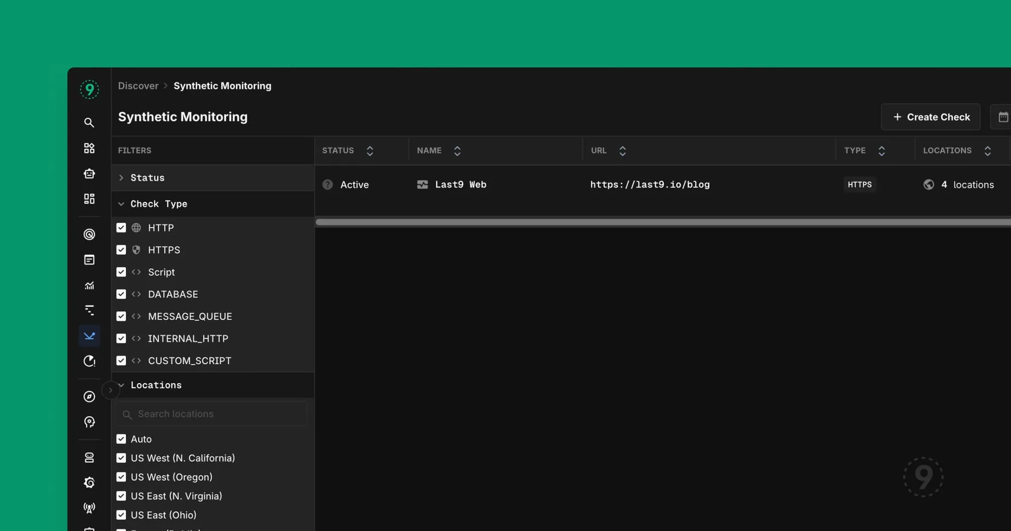
Synthetic Monitoring: Stop Being the Last to Know
Let’s be honest about what most monitoring actually does: it tells you that something broke, after it broke, based on production traffic patterns that may or may not exercise the thing that just broke.
Here’s the problem with relying on real user traffic for monitoring:
- Low-traffic endpoints don’t generate enough signal until the damage is done
- Your midnight deployment doesn’t get tested until the morning rush
- Regional issues in locations with fewer users fly under the radar
- Critical paths that users rarely traverse (password reset, anyone?) can be broken for weeks
Synthetic monitoring flips this. You define the checks. You pick the locations. You set the assertions. The system pokes your endpoints continuously, from multiple geographic locations, using HTTP, HTTPS, TCP, DNS, and ICMP.
What this looks like in practice:
You create a check that hits your /api/health endpoint every minute from five different regions. You assert that it returns a 200, that the response includes "status": "healthy", and that it responds in under 500ms.
At 3:47 AM, your cloud provider has a network blip in us-east-1. Your synthetic check fails from that location. You get alerted. You investigate. You find out AWS is having issues. You post a status update before your users even wake up.
That’s the difference between “we’re on it” and “we’re investigating reports of…”
The dashboard integration means you can put synthetic check results right next to your application metrics. Request latency chart on the left, synthetic check status on the right. Now you can see whether slowdowns are affecting real users or if it’s your monitoring being paranoid.
Get started: Navigate to Synthetic Monitoring in the sidebar. Create your first check in about thirty seconds.
Host Health Heatmap: Because You Can’t Scroll Through 400 Hosts
There’s a certain flavor of denial that happens at scale. When you have five servers, you know them by name. You SSH into them. You have opinions about which one runs hot.
When you have fifty servers, you have a spreadsheet.
When you have five hundred servers, you have… hope? Prayers? A vague sense that Kubernetes will figure it out?
The Host Health Heatmap is for the moment when “I’ll just check the servers” becomes logistically impossible. It’s a grid. Each cell is a host. The color tells you how much trouble it’s in: green for healthy, yellow for “keep an eye on this,” red for “someone should probably look at this right now.”
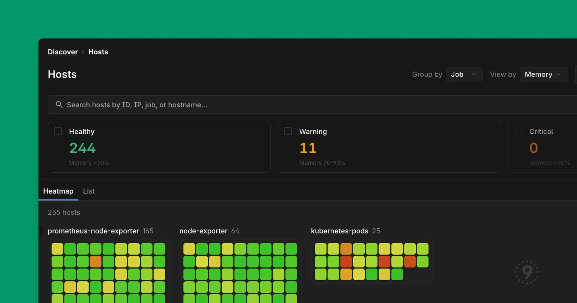
But here’s the thing that makes it actually useful: you can search, filter, and group.
- Search by name or IP when you know what you’re looking for
- Filter by health status when you’re triaging an incident (“show me all the critical hosts”)
- Group by job when you need to see if a problem is isolated or systemic
When your pager goes off at 2 AM and you need to answer “is this one bad host or a cascading failure,” you don’t want to be running kubectl commands and parsing JSON. You want to look at a picture and immediately know.
Host Processes Tab: Process Metrics Where You’re Already Looking
You probably already have process-level metrics somewhere. Maybe it’s a node exporter dashboard. Maybe it’s an APM tool. Maybe it’s “SSH in and run top.”
The problem isn’t collecting process data. The problem is context-switching to find it when you need it.
You’re looking at a host. CPU is spiked. You want to know which process is responsible. In most setups, that means opening another tool, finding that host again, hoping the time ranges line up, and mentally correlating what you’re seeing.
We put process metrics on the host page itself. Same place you’re already looking. Click “Processes,” and you’re looking at CPU, memory, and disk I/O for every process on that machine. Click a column to sort. The thing eating all your resources floats to the top.
The other thing: history. Most process monitoring shows you right now. That’s useful if you catch the problem while it’s happening. Less useful when you’re trying to figure out what happened twenty minutes ago, before the OOM killer cleaned things up. We keep the history, so “was it always like this?” has an answer.
No additional agents. No separate dashboard to configure. If you’re already sending host metrics to Last9, you have this. It’s just there.
Get started: Go to any Host details page and click the “Processes” tab.
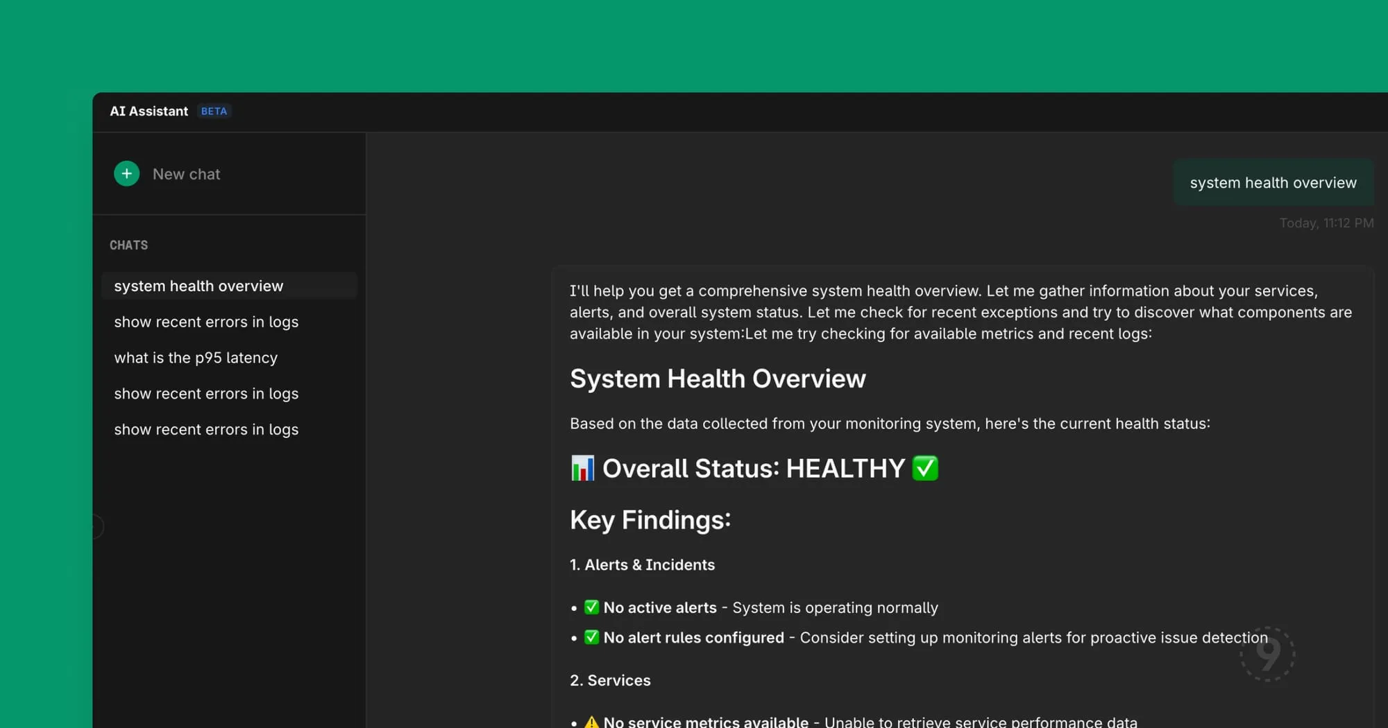
AI Assistant Streaming: Because Watching a Blank Screen is Psychological Torture
We made the AI responses stream in real-time instead of appearing all at once.
This sounds like a small thing. It’s not.
There’s research on this (and also just common sense): perceived wait time matters as much as actual wait time. When you ask a question and see nothing for eight seconds, you start wondering if it’s broken. You start composing a retry. You start questioning your life choices.
When you ask a question and immediately see the response forming, word by word, you feel like progress is happening. You stay engaged. You start processing the answer before it’s complete.
It’s the same reason good command-line tools show progress bars. Not because the progress bar makes things faster—it doesn’t—but because uncertainty is cognitively expensive.
For enterprise deployments, you can bring your own LLM API keys. Your queries, your data, your model provider. We also support running against your own hosted models if that’s what your security posture requires. The AI Assistant works the same way—it just talks to your infrastructure instead of ours.
Also In This Release
We shipped a lot of smaller improvements that add up. Here are the ones worth knowing about:
Command Palette Dashboard Search (Cmd+K) — You can now search for dashboards directly from the command palette. When you have dozens of dashboards, this is the difference between “give me the API latency dashboard” and “let me click through three levels of navigation.”
Legend Placement for Charts — Configure where chart legends appear. This matters more than it sounds like when you’re fitting four charts into one dashboard row and the legends keep eating your vertical space.
Filter By on All Log Fields — Right-click any field in a log entry to add it as a filter. Not just the indexed fields. Any field. The number of times we’ve watched people manually copy a value and paste it into a filter box…
Errors & Exceptions UX Overhaul — Clearer labels, scrollable filter panels, and 5xx error rate calculations that actually count only 5xx errors. This was embarrassing. It’s fixed.
Related Logs in Traces — When you drill into a trace and want to see related logs, you now get proper time range context and the same search capabilities as the main logs view.
Full Stack Traces — Trace exceptions now show the complete stack, including React component stacks. Frontend debugging is hard enough without your tools hiding half the information.
The Point of All This
Every feature we shipped this cycle is about the same underlying problem: reducing the time between “something is wrong” and “I understand what’s wrong.”
Synthetic monitoring: know about problems before users do. Host heatmaps: see patterns that would take minutes to grep for. Process visibility: find the culprit without SSH-ing anywhere. AI streaming: get answers faster (or at least feel like you are). Dashboard search: navigate faster. Better logs and traces: investigate faster.
Observability isn’t about collecting data. It’s about answering questions. The faster you can answer “what’s broken and why,” the faster you can fix it and go back to building things.
That’s it. That’s the release.
Try synthetic monitoring today—it’s in the sidebar. Create your first check in under a minute.

