
Start with distributed tracing to find which service is slow, then use continuous profiling to see why the code is slow, and finally apply high-cardinality analysis to identify which users or conditions trigger the problem.
It’s 2 AM. Your phone buzzes. Users are reporting timeouts. The metrics dashboard shows p99 latency spiking from 200ms to 4 seconds, but everything looks normal-CPU at 60%, memory stable, no error spikes. A quick pod restart helps briefly, then latency climbs right back up.
This pattern shows up more often than we’d like.
Latency spikes usually have a specific trigger. The database might be slow because a query plan shifted, a connection pool ran dry, or garbage collection happened to pause during a traffic burst. Finding that trigger is the tricky part.
According to Observability Forecast, 62% of organizations say high-business-impact outages cost at least $1 million per hour. The median? $1.9 million per hour.
What Actually Causes Latency Spikes
Most production latency issues trace back to a short list of culprits. Each has a signature if you know what to look for.
Database Connection Pool Exhaustion
Sometimes an API handles 1,000 requests per second in testing but struggles in production. The traffic itself isn’t the issue-it’s that every request needs a database connection, and the pool has a fixed size.
When active connections reach maxPoolSize, new requests wait. With timeouts often set around 30 seconds, threads can block for a while. Wait times climb even though the database itself has capacity.
Each PostgreSQL connection consumes up to 1.3MB of memory and adds 20-50ms establishment latency. When pools exhaust, you’re not just slow-you’re paying for it in memory and connection overhead.
In Java applications, lock contention shows up as threads blocked at AbstractQueuedSynchronizer.parkAndCheckInterrupt(). If you see that in your thread dumps during a latency spike, your connection pool is the problem.
When connection pools exhausted, the real challenge is figuring out what the slow request was waiting on - the database call, a blocked thread, or a specific query path. You need correlated telemetry to answer that cleanly.
Last9’s Trace Explorer gives you that view. Each trace shows the wait time on the database span, the point where the request got stuck behind the pool, and the exact endpoint that pushed the pool over its limit.
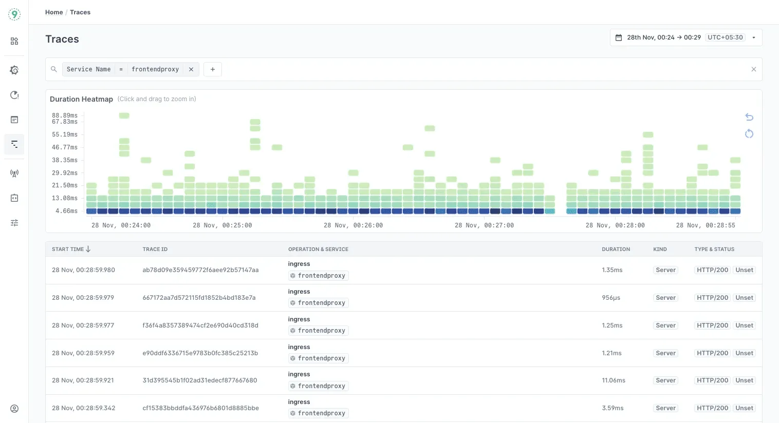
Because metrics and logs sit right next to the trace timeline, you can match the spike in wait time with the pool’s active-connection count and thread-blocking logs. It turns a vague latency graph into a precise sequence of events.
Garbage Collection Pauses That Don’t Look Like GC Pauses
Modern garbage collectors typically keep pauses under 50ms. But sometimes logs show something unexpected:
[Times: user=0.36 sys=0.01, real=15.77 secs]That’s 15 seconds of wall-clock time with almost no CPU time. LinkedIn Engineering found that GC logging itself can be blocked by background I/O during stop-the-world pauses. They saw 11+ second pauses even with CMS collector-not because GC was slow, but because writing GC logs to a saturated disk blocked the entire pause.
The fix: move GC logs to SSD or use -Xlog:async (OpenJDK 17+) for asynchronous logging.
This is why monitoring GC metrics alone isn’t enough. You need to see the actual pause times your users experience, correlated with traffic patterns and deployment events.
Network Retransmissions Hiding in TCP
Intermittent latency spikes sometimes follow a specific pattern: 1s, 3s, 7s, 15s, 31s.
Those intervals match TCP retransmission exponential backoff. When this pattern appears, it often points to SYN packet retransmission-something between services is dropping packets.
Cloudflare had a different TCP-related issue where Linux’s tcp_collapse() function was causing latency. This function runs when receive buffers fill and merges adjacent TCP packets to free memory. They measured it adding an average of 3ms and max 21ms per execution. Their fix: reduce tcp_rmem maximum to 4MiB, offering a compromise between reasonable collapse times and throughput.
The tricky part: these issues don’t show up in application logs. You need kernel-level visibility or network traces to catch them.
CPU Saturation Hiding Behind Averages
Brendan Gregg often highlights a simple trap: an average CPU number doesn’t tell you how often a service is momentarily running out of headroom. A dashboard might show 60–70% average utilization, but the real issue is the short bursts where CPU demand reaches the limit. Those bursts are enough to cause brief queues, and minute-level sampling smooths them away.
This comes up often in containerized environments. A container may handle steady traffic comfortably, yet still hit short CPU bursts that push it to its configured limit. When that happens, the scheduler delays execution until the next time slice, and even small delays ripple into tail latency.
If latency spikes appear without a clear resource-exhaustion signal, it’s worth looking at CPU burst patterns, per-container throttling counters, and scheduler delays.
If latency spikes point toward container-level stalls, this guide on configuring Docker’s shared memory limits can help prevent those bottlenecks!
3 Debugging Methodologies That Work Well in Production
When latency spikes show up in production, the hardest part isn’t collecting metrics - it’s knowing how to interpret them.
A good framework keeps you from chasing noise. These three approaches often work well together because each one answers a different part of the debugging story.
1. USE Method: Start by Checking if the System Is Under Pressure
Brendan Gregg’s USE Method (Utilization, Saturation, Errors) is a reliable first step because it answers a simple question: Is any resource running out of room?
In practice, you’re looking for things the system had to wait on:
- CPU run-queue length rather than just percent busy
- Memory paging rather than just free RAM
- Network drops rather than just throughput
Even a small amount of saturation adds queuing delay, so USE helps you spot the infrastructure-level signals that raw averages hide. It’s the quickest way to rule out “is the hardware struggling?” before digging deeper.
2. RED Method: Then Check How the Service Is Behaving Under That Pressure
If USE shows the system is healthy, the next step is understanding what callers are experiencing. That’s where the RED Method comes in - described by Tom Wilkie.
Source:
RED focuses on three service-level signals:
- Rate - how much traffic is arriving
- Errors - how many requests fail
- Duration - how long requests take
Together, these show whether the service is slowing down because it’s overloaded, failing because something downstream is unhealthy, or simply seeing demand patterns it wasn’t sized for. RED gives you the viewpoint of the user, not the machine.
3. Four Golden Signals: Add Latency Nuance Before Drawing Conclusions
Once you know how the service is behaving, the Four Golden Signals from the Google SRE Workbook add an important layer of nuance: latency isn’t one metric. Successful requests and failed requests often have very different timing profiles.
A useful rule of thumb from the workbook: if p99 latency grows far beyond the median - usually more than 3–5× - the system is dealing with tail latency, not overall slowdown. That distinction matters because tail problems often come from retries, load imbalance, or a single dependency becoming slow, not from full-system overload.
This way, you move from symptoms → infrastructure health → service behavior.
That path keeps the investigation grounded, reduces dead ends, and works consistently across microservices, proxies, and sidecar-heavy deployments.
Linux-level signals often explain latency spikes that aren’t visible in application metrics, and this guide maps where those logs live!
Modern Tools That Make Debugging Faster
Debugging production latency used to mean stitching together metrics, logs, and traces by hand. Modern telemetry systems simplify this. Most of the correlation work now happens inside the pipeline, not inside your head.
OpenTelemetry: A Common Language for Telemetry
OpenTelemetry isn’t a backend - it’s a standard. It defines how applications emit traces, metrics, and logs, and ensures they share the same attributes and identifiers. This makes cross-signal correlation possible no matter where the data eventually goes.
Two features help a lot during debugging:
- Span Metrics: Latency histograms can be generated directly from trace data, giving you request-duration patterns without maintaining separate metric definitions.
- Tail-Based Sampling: Sampling decisions happen after a trace completes, which guarantees that slow or erroring requests are kept even when you sample aggressively.
Together, they reduce the chance of losing the exact data you need when investigating a spike.
High-Cardinality Data: Asking Questions You Didn’t Plan For
Latency debugging often hinges on details that were never encoded into predefined dashboards: which customer saw the spike, which deployment introduced the slowdown, or whether a feature flag correlates with the issue.
High-cardinality telemetry preserves the attributes that matter - request identifiers, configuration flags, deployment metadata, routing decisions - without forcing you to decide up front which labels are “allowed.”
This enables natural questions during incidents, such as:
- Are slow requests concentrated on a specific customer or tenant?
- Did a deploy introduce the spike?
- Does the latency align with a new code path or feature flag?
Last9 fits into this model by handling high-cardinality data natively, so your team can include rich request attributes without worrying about storage blowups or cost penalties.
Exemplars: Link Metrics to Specific Requests
Exemplars are small metadata attachments that connect a metric point - like p99 latency - to a specific trace. They embed trace_id and span_id into the metric stream.
The benefit is simple:
When latency jumps, you can move directly from the metric you’re observing to an example request that shows what happened. No guessing which trace to open. No, hoping a rare slow request was sampled.
Any backend that supports exemplars will typically surface them as markers on latency or throughput charts, making it easy to jump from an aggregate view to a concrete instance.
eBPF: Visibility Without Touching Application Code
eBPF gives you kernel-level visibility with low overhead and zero instrumentation inside the application. It can observe:
- network paths and message flow
- system calls
- file and socket activity
- CPU scheduling and contention patterns
For debugging latency, eBPF fills the gaps between what traces show at the application layer and what the kernel is doing underneath - especially when the slowdown sits in queues, buffers, or scheduler decisions rather than your code.
Dynamic instrumentation is another useful capability: you can attach temporary probes to functions in a running process without a redeploy, making it easier to inspect suspicious paths during an active spike.
Continuous Profiling: Understand Why Code Is Slow
Traces tell you where time was spent. Profiling explains why.
Continuous profiling captures stack samples over time and correlates them with requests or spans. When you open a slow operation, embedded profiles show exactly which functions or code paths dominated CPU time.
This is particularly helpful when:
- latency is caused by lock contention
- hot paths get more expensive under load
- CPU usage looks normal, but tail latency grows
- something regresses between deploys but doesn’t fail outright
Low-overhead profilers - including eBPF-based ones - let you run this continuously without worrying about destabilizing production.
Why Percentiles Matter More Than Averages
Latency doesn’t behave like a single number. Most requests finish quickly, a few take much longer, and those outliers shape the user experience. Averages flatten this entirely. A system can show a comfortable median while a small slice of traffic is waiting seconds.
Percentiles fix that by revealing the shape of the distribution. They help you see whether:
- Most requests are fast, but a few are stalling
- The tail is widening during bursts
- retries or queueing effects are pushing latency upward
This is the view you need when debugging real systems, especially ones where tail behavior creates cascading effects long before the median moves.
The Coordinated Omission Problem
Gil Tene’s “coordinated omission” explains why some latency spikes never show up in synthetic tests. When a server stalls, many load generators quietly reduce the rate of new requests. The tool adapts to the slowdown instead of measuring it.
The impact is subtle but dangerous:
- No new requests are issued during the stall
- Latency appears stable, even though in-flight requests are stuck
- test results understate tail behavior by an order of magnitude
This mismatch is why a workload can show smooth p99s in testing yet produce multi-second spikes in production.
Why Percentiles Don’t Aggregate
Percentiles expose tail behavior, but they don’t combine across nodes or time windows. Percentiles depend on the full distribution of values; if you only keep the p99, you can’t merge it with p99s from other sources to get anything meaningful.
To preserve the distribution shape, you need data that retains more structure. Heinrich Hartmann highlights three practical options:
- Raw event logs - precise but heavy
- Counts and sums - light but limited
- Histogram metrics - efficient and distribution-aware
Histograms strike the right balance. They capture how requests are spread across latency buckets, allowing you to compute accurate percentiles across services, time windows, or high-traffic workloads.
Last9 stores histogram data by default, ensuring that percentile calculations stay accurate even as traffic scales or when comparing latency across clusters, deployments, or user cohorts.
Find the Real Cause of Latency With the Right Context with Last9
Latency spikes make sense only when you can see the full picture. Last9 keeps the context that other tools drop, so you can move from “something is slow” to “this is why” without digging through multiple dashboards.
Correlation is automatic. Click a spike, open the slow traces, and see the matching logs instantly - all linked by trace_id.
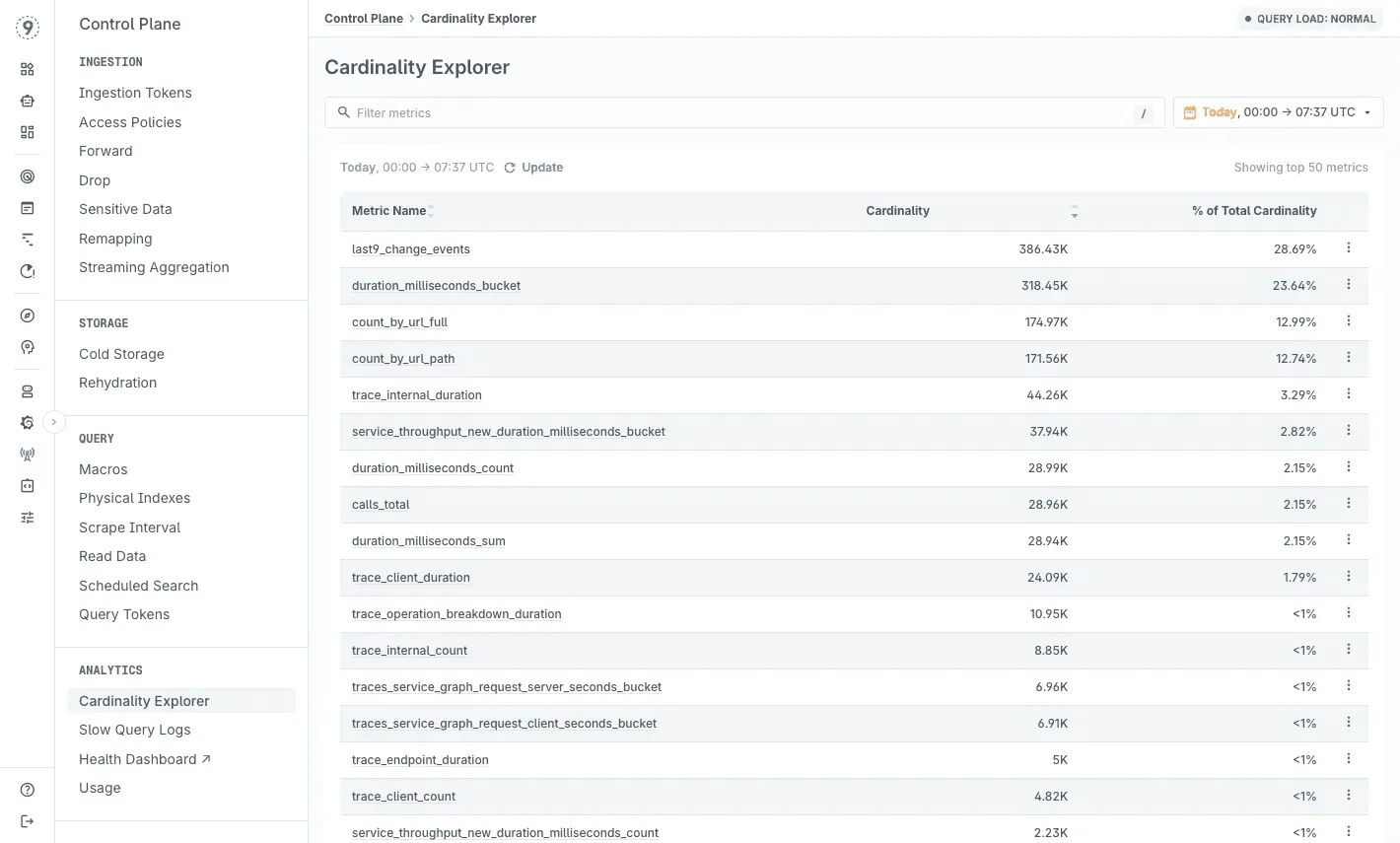
Streaming aggregation at ingest trims noisy, short-lived labels while keeping high-detail data where it matters, so queries stay fast even as dimensions grow.
Cardinality insights highlight which labels or deployments introduced new series, helping you catch unexpected changes early.
And because costs scale with no. of events ingested, not label count, you can keep customer IDs, endpoint labels, deploy metadata, and feature-flag context without worrying about limits.
The result: fewer dead ends, less guesswork, and a much clearer path to the real cause of a latency spike.
Try Last9, or talk to our team to see how it works with your stack.
 Nishant Modak
FAQs
What’s the fastest way to identify which service is causing latency?
Start with distributed tracing. Open a trace for a slow request and study the waterfall: the longest span is usually your first lead. If several services slow down together, look for a shared dependency or a retry pattern masking the real fault upstream.
In Last9, you can jump directly from a latency spike to the slowest traces and break them down by endpoint, customer, or deployment to see where the slowdown starts.
How do I know if my latency spike is caused by GC or something else?
Begin with GC visibility:
- Check pause durations and how often cycles run.
- Compare “real” time vs. user + sys CPU time in the logs - a big gap usually means blocking on I/O or locks rather than GC work.
- Align GC activity with p95/p99 latency over time. Matching periodic spikes is a strong clue.
If your GC metrics and logs flow through OpenTelemetry, Last9 can overlay GC events on request latency and error trends so you don’t have to correlate manually.
Why do my metrics show everything is fine, but users are complaining about slowness?
This usually happens when the metrics you’re looking at don’t capture tail behavior. Examples:
- Averages hide short 100% CPU bursts
- Median latency hides the slowest 1% of requests
- Aggregate metrics bury per-endpoint or per-customer issues
Users experience the tail, not the average. Percentiles (p95, p99, p99.9) and saturation metrics-queue depth, thread blocking, connection pool usage-tend to reveal the pattern.
What’s the difference between the USE and RED methods?
They solve different parts of the debugging problem.
- USE (Utilization, Saturation, Errors) applies to infrastructure resources. It answers: Is the system queuing work?
- RED (Rate, Errors, Duration) applies to services. It answers: What are users experiencing?
A system can pass USE checks but still fail RED checks if, for example, a downstream dependency is slow.
How do I prevent retry storms during latency incidents?
Retry storms amplify small failures. A few defensive patterns help:
- exponential backoff with jitter
- circuit breakers that open on latency or error thresholds
- tracking retry rate separately from error rate
If retries spike alongside latency, the system is self-amplifying.
Can I debug latency issues without instrumenting my code?
You can get part of the picture. Low-overhead, kernel-level techniques (including eBPF-based collectors) can show you network activity, scheduling delays, I/O behavior, and system-level stalls without touching application code.
But they can’t answer business-level questions like:
“Which customer is impacted?”
“Which feature flag was active?”
“Which deployment introduced the slowdown?”
That context comes from instrumentation. OpenTelemetry auto-instrumentation provides it with minimal setup. Once exported to any backend like Last9, you can correlate low-level system behavior with high-level request context in one place.

