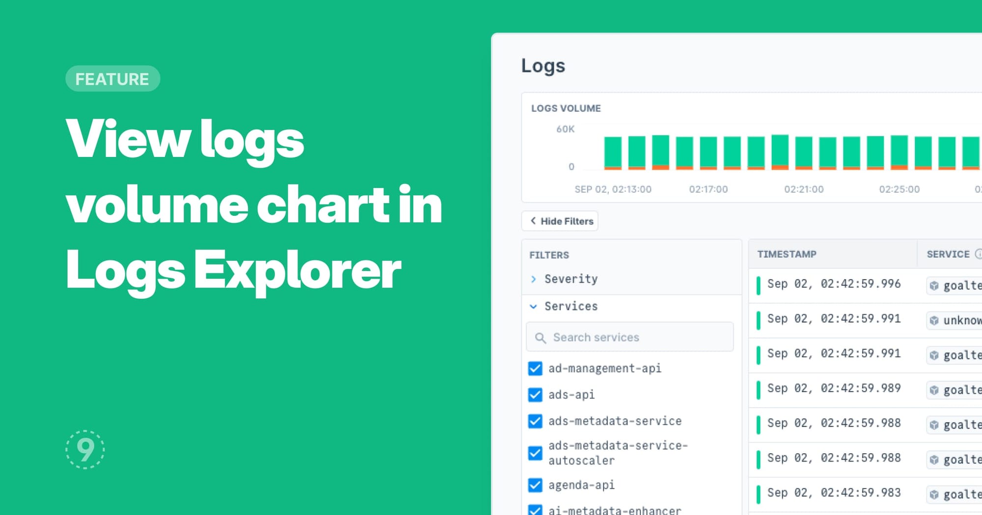
The Logs Explorer now visualizes your per minute log volume in a stacked bar chart. Each minute’s bucket also indicates the severity volume. The number of bars is dependant on the selected time window.
Some handy use cases that the chart unlocks are:
- Use filters to narrow down scope to a severity, service, or an attribute to understand patterns and identify any deviations.
- Track any changes in volume during or after a deployment to analyze any impact.
- Identify cost optimization opportunities by seeing variations in logging volume different services.
- Report usage patterns by identifying peak hours, distribution across geographies, technologies, etc,
